Responsive Web design
User friendly and effective websites for multiple device
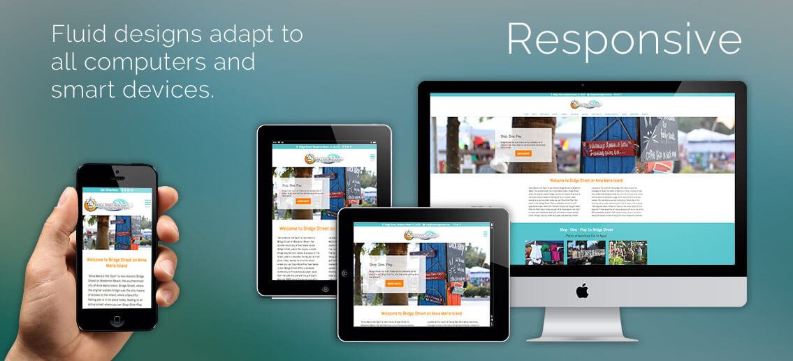
Mobile Responsive Web Designing (MRWD) is an approach to Web Design aimed at allowing desktop webpages to be viewed in response to the size of the screen or web browser one is viewing with the fluid grid concept calls for page element sizing to be in relative units like percentages, rather than absolute units like pixels or points. Flexible images are also sized in relative units, so as to prevent them from displaying outside their containing element. Media queries allow the page to use different CSS style rules based on characteristics of the device the site is being displayed on, most commonly the width of the browser.
At Bhipra Software, being a professional web design company from Kanpur, we craft one website in such a way that it provides an app-like viewing experience on all devices like smartphones, tablets & e-reader apart from desktop, with easy reading and no requirement of resizing the page or font. Now is the age of smartphones and survey reports that more than 25% web users are mobile only. RWD (Responsive Web Design) provides best quality browsing experience, as mobile device requires simple navigation, clear and readable content & fast page loading. In RWD, a user needs not to zoom or scroll the page left to right to read the content, that makes your website user friendly.
RWD (Responsive Web Design) provides best quality browsing experience, as mobile device requires simple navigation, clear and readable content & fast page loading. In RWD, a user needs not to zoom or scroll the page left to right to read the content, that makes your website performer and user friendly.